Regardless of your business or online property, one key essential is that all of your websites are mobile-friendly. More and more consumers are choosing to use their smart phone or tablet to surf the Internet in favor of a personal computer or laptop. We would never recommend launching a website without a plan to offer your content on multiple devices.
In this step by step tutorial, we’ll show you how to make your website both responsive and mobile-friendly.
1. Register Your Domain Names.
2. Setup Your Web Hosting
3. Install Wordpress
4. Responsive Design or Mobile Website?
5. Setting up a Responsive Design
6. Setting up a Mobile Website
Step 1: Register Your Domain Name(s)
Before you can get started with your mobile friendly website, you need to register your domain. It’s possible you already have one, but here are some suggestions to follow:
Attempt to obtain a top-level domain name for your brand. – A top-level domain includes .com,.net, and org. These are most respected by search engines, social media, and have been around the longest. Even if your desired name is taken, spend some time to come up with other variations.
Register additional TLDs. – After you have your “main” TLD it’s important to register additional TLDs to protect your brand. These can easily be forwarded to your main name and can be a very effective way for you to track your offline and billboard advertising. You want to start by making sure you register all other available top level domains (.com, .net, and .org) and then branch out to .mobi, .us, .biz, .co, etc. The more you register, the more your brand is protected. (We recommend at least .com, .net, .org, .mobi, .biz)
Keep Your Name Simple – It’s very possible that your first couple attempts at a top-level domain name are going to be taken. If you have to add abbreviations such as “Inc” or “LLC” that’s fine. You’ll find more of the “additional TLDs” are available to only include your name that you can use in your advertising. As we mentioned above, you can easily forward as many names as you want to the same website.
You can begin the registration process URL: https://www.webfoundr.com/domain_registration
Step 2: Setup Your Web Hosting
Once you have all of your names registered, you’ll need to setup your web hosting so you have somewhere to publish your new website. If you followed the above steps accordingly, you should have selected your “main” domain name that is going to serve your website. You can then forward your other names to this one website, which we’ll explain later.
By now your domain names should be in your cart as displayed in this screenshot:


Essential - Get everything you need to establish your professional online presence. Perfect for businesses that prefer to manage their own website.Fully Managed - We become your complete technology department. Ideal for businesses that want a hands-off, fully serviced approach.
We offer two powerful Business Solutions designed to meet you where you are in your growth journey. Whether you're establishing your professional presence or ready to fully outsource your technology needs, we have a plan for you.
Still deciding? You can start with our Essential plan and upgrade to Fully Managed at any time. Our Webfoundr Support team is here to assist you every step of the way!
Once you decide on your plan and your billing cycle you can proceed back to your cart to finish up the configuration.
When you successfully complete your payment, your domains and web hosting will automatically be provisioned on our platform. Please check your email for corresponding invoices, login credentials, and other important information you should print and save for your records.
Step 3: Install Wordpress
We have step by step instructions on how to install Wordpress in our extensive Knowledge base at this link.
Step 4: Responsive Design or Mobile Website?
Once you have Wordpress installed, you are literally minutes away from your mobile friendly website. Now, you must to decide whether you want to utilize responsive design, a mobile website, or both! In this example, we're going to show you how to do both.
Step 5: Setting up a Responsive Design
You need to find a Wordpress theme that is responsive. This can be done by going to websites such as ThemeForest.net and searching for designs that are responsive. Once you find one and download, follow the instructions to design it.
Tip: Did you know you can select responsive designs in our easy Wordpress installation that we showed you at this link. You can and that's exactly what we're going to show you!

Click on the Log in WP Toolkit. It will redirect you to wp-admin area. On the left side, hover over Appearance and click Themes


We have selected the Twenty Twenty-Five theme, which is available in our Wordpress installation guide. You can find many colorful and diverse themes there but here is what the Themes page looks like in Wordpress.
For our theme Twenty Twenty-Five , all we have to do is tick the box that says " Check the box if you want the Responsive Layout of your Website", scroll down and click Save Options. Our design is now responsive.

Step 6: Setting up a Mobile Website
Wordpress makes it easier than ever to setup a mobile-friendly website by use of a diverse and free plugin called WPtouch Mobile Plugin. To install, we're going to head on over to the plugins page in our Wordpress install. You can do this by accessing your Wordpress admin page and clicking plugins on the left side.


Type WPtouch Mobile in the search box at the top right of the page. After you have typed in the search box, press enter on your keyboard and this should be the first result that is returned:
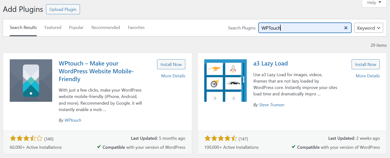

Click the Install Now button in the top right corner (pictured above). A prompt window will ask if you are sure, in which you will click OK


Click Activate Plugin and your website is now mobile-friendly.


Our website now how has a mobile friendly design. The visitor also has the option to revert back to the Desktop version, which is responsive, by tapping the link pictured above. The WPtouch Mobile plugin is completely customizable within the Wordpress interface, however, as you can see, just by installing it creates an immediate response in just a few simple steps.
Now that you have completed this guide, your website should be both response and mobile-friendly. Happy developing and be sure and let us know if we can be of further assistance.